Protest Design Evaluation
Overall Effectiveness
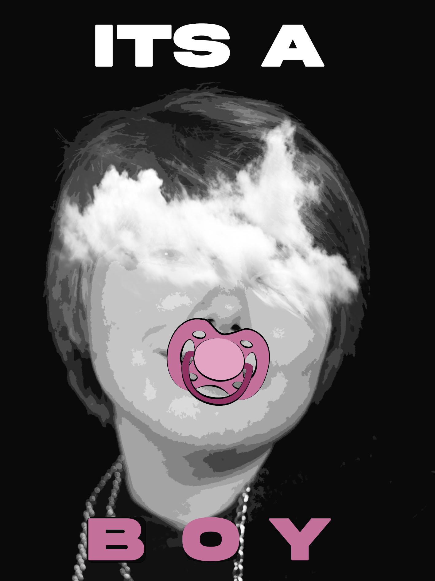
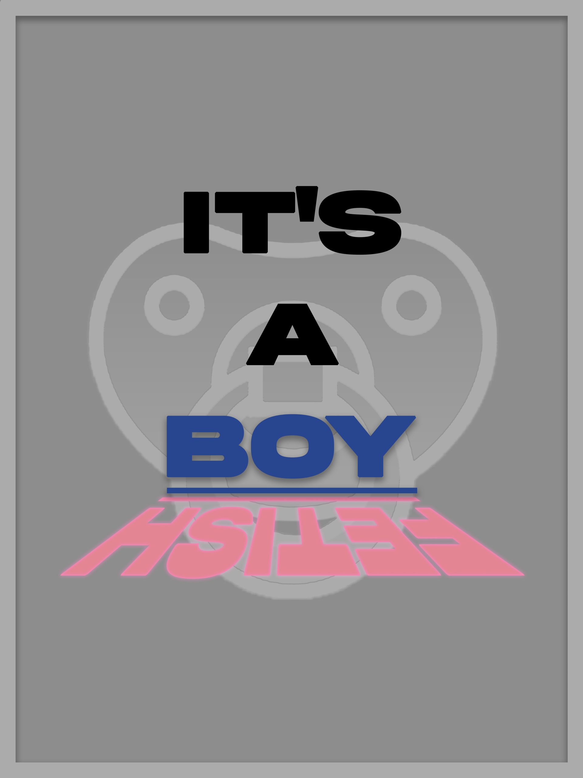
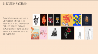
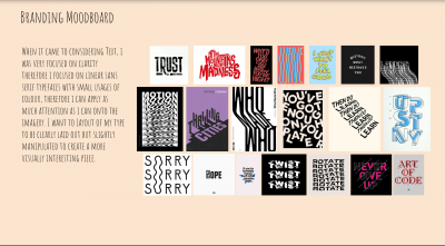
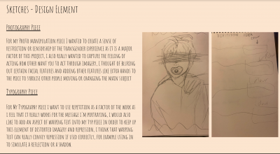
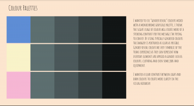
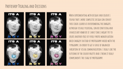
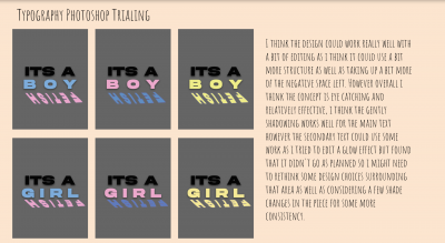
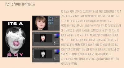
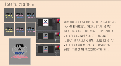
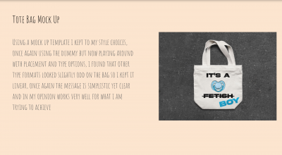
I attempted to convey the struggles of repression that trans youth face in the media with fetishisation and infantilisation, by using derealisation in my piece I managed to represent a stripped identity to mirror the experience of fetishisation. I did this by manipulating portraits in photoshop. I used a bold sans serif font to create a greater sense of clarity for the viewer, this bolder font approach gives the message more of a commanding tone which works very well for protest art. I was inspired by the black and white photography of Barbra Kruger and how she uses minimal colour to reinforce her points. I did make the colour I used more relevant to the subject matter as I didn’t think red was very fitting, however I was very inspired by how she uses colour in her pieces. I used colours associated with gender reveals to connect more to my target audience of transgender youths and allies to the trans community. I am very proud of the deliverables that I have produced, the design choices are consistent like the font and colour palette and I am proud of how clear I made the message. However in future I would experiment more with my design choices and perhaps work on something a little more visually interesting in order to push the boundaries instead of playing it safe like I usually do.
Production Process
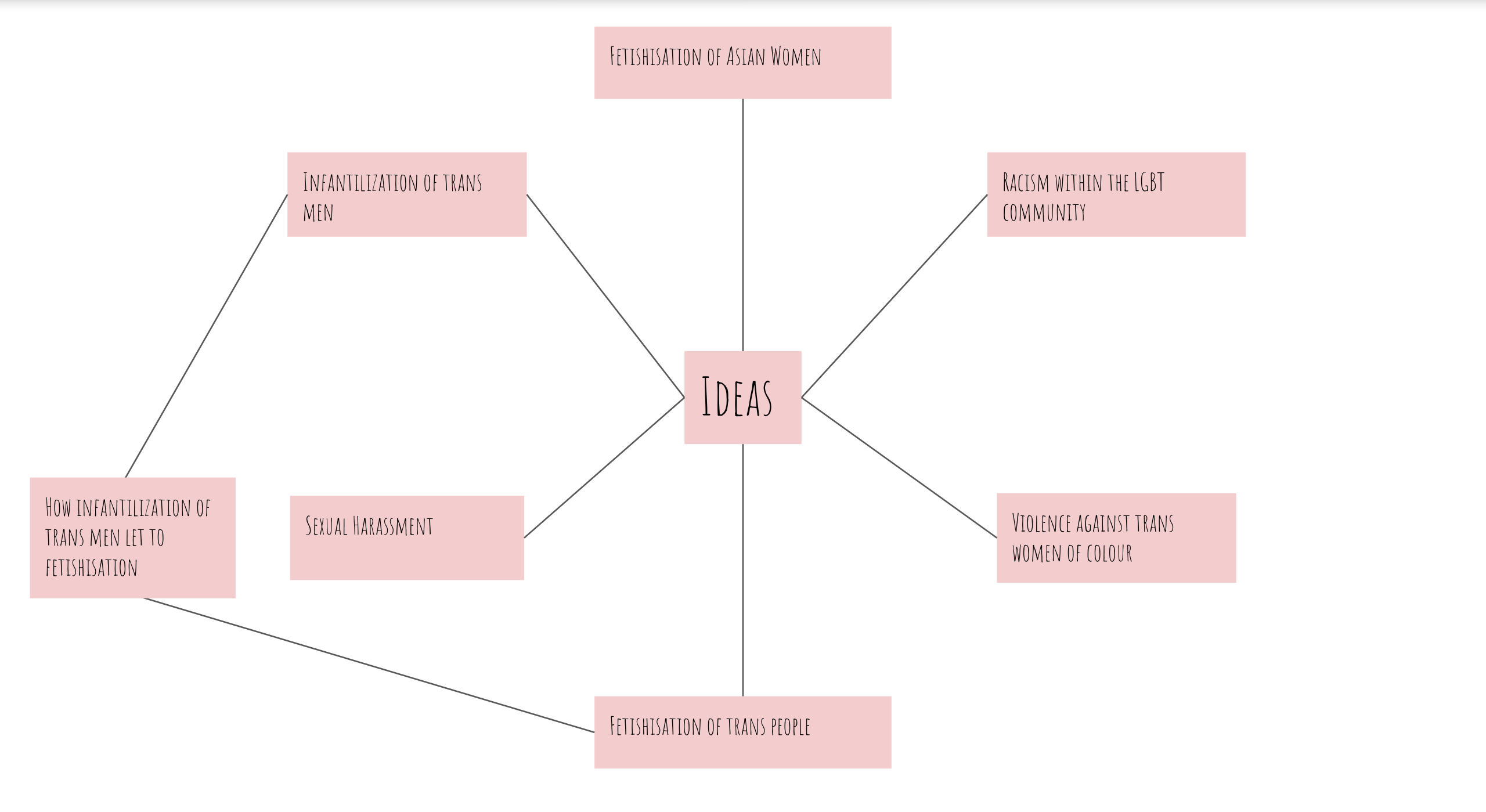
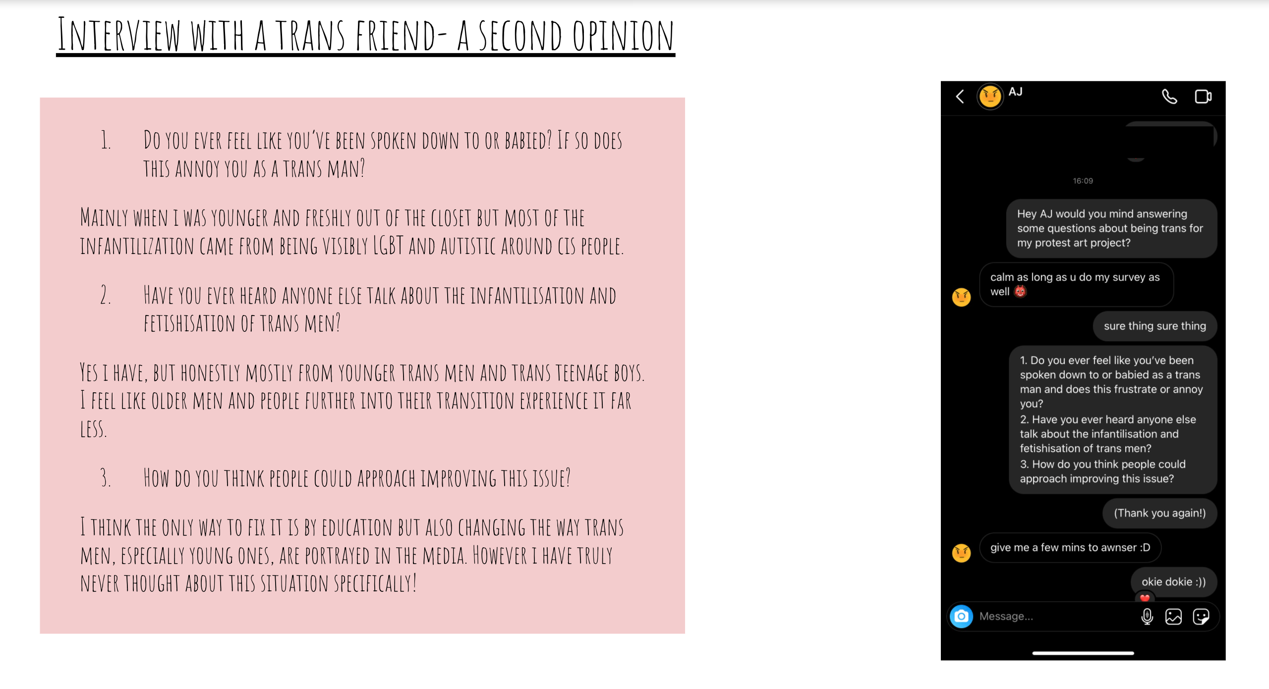
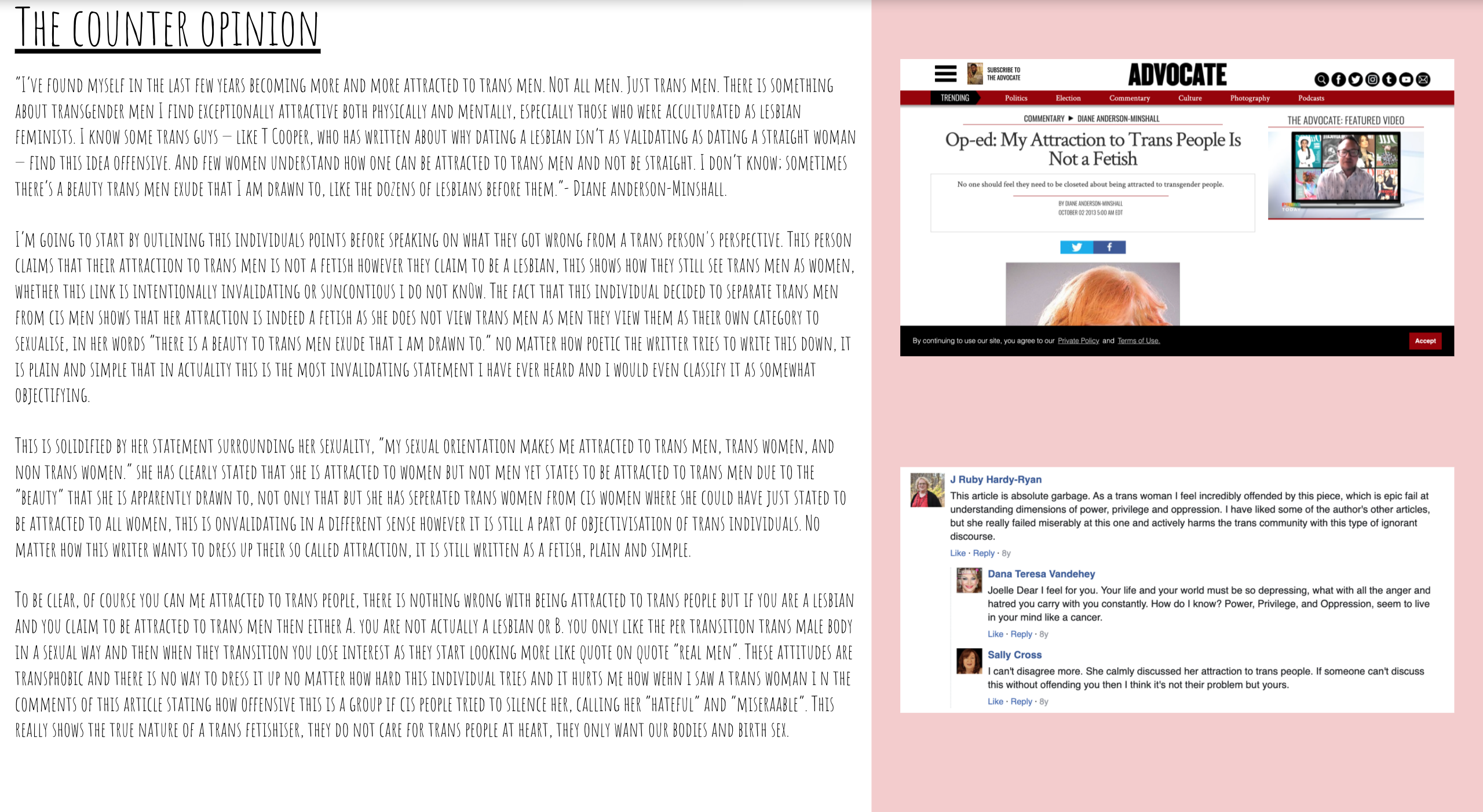
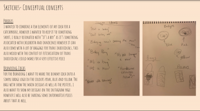
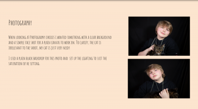
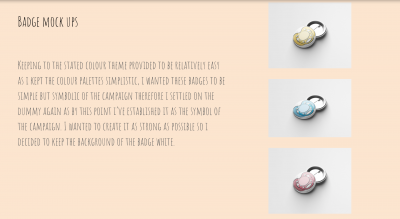
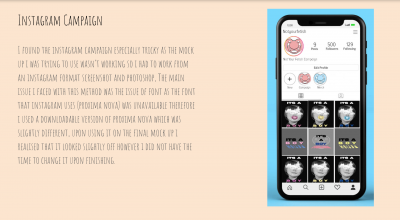
I began my process by gathering my own experiences as well as other trans people I know personally, then I proceeded to research others experiences and ideas on the topic of trans fetishisation and infantilisation. By doing this I had more context to work with as I continued with my production. After the initial research I shared this research with my other friends to find out how much they had heard about the subject and what they’d want to know about it. This step was to figure out how I should display information and how I should narrow down this information into the final deliverables. After this I entered the planning stage where I began to think about colour palettes and type I should be using, as I previously stated I chose a gender reveal palette colours and a linear sans serif, bold, typeface. At this point I took photos and began to manipulate them to achieve the desired effect before adding type and applying the chosen colours, once they were all dont i had my initial posters and designs. These phases were crucial to the process as I could apply my researched knowledge to my final deliverables, for example how colour could reach out to the trans community. After these stages were all done i moved on to production, i already came up with my designs so i used mockups to create merchandise from certain aspects of the designs and then used the posters for my instagram campaign, by pre making my designs prior to the start of production, i was able to create the deliverables a quicker. They were effective as the colour palette really worked with the subject theme and I think it conveyed the issues efficiently however in future I would probably attempt to be a bit more adventurous with my designs as my designs although were effective proved to be a bit repetitive.
